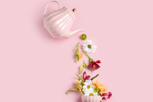
Creating beautiful flower arrangements involves more than just selecting your favorite blooms, color matching plays a crucial role in achieving a harmonious and aesthetically pleasing design.
Here’s a guide to help you master color matching in flower arrangements!
1. Understanding Color Theory
Color Wheel: Familiarize yourself with the color wheel, which shows primary, secondary, and tertiary colors. This tool is essential for understanding how colors interact.
Color Harmony: Colors can be combined in various ways to create harmony:
- Complementary Colors: Opposite colors on the wheel (e.g., blue and orange) create vibrant contrasts.
- Analogous Colors: Colors next to each other on the wheel (e.g., blue, blue-green, and green) create a serene and comfortable look.
- Triadic Colors: Three colors evenly spaced on the wheel (e.g., red, yellow, blue) for a balanced yet vibrant arrangement.
2. Popular Color Schemes
Monochromatic: Using different shades and tints of a single color. This creates a sophisticated look.
Complementary: Pairing colors like purple and yellow or red and green for a bold effect.
Analogous: Combining colors such as orange, yellow, and red for a warm, cohesive feel.
Pastel Palette: Soft colors like light pink, lavender, and baby blue for a gentle, romantic arrangement.
Bold and Bright: Vibrant colors like fuchsia, lime green, and bright yellow for a lively and energetic display.
3. Seasonal Colors
Spring: Soft pastels (pink, lavender, light green) for a fresh feel.
Summer: Bright and bold colors (sunflower yellow, vibrant orange, deep pink).
Fall: Warm earth tones (red, orange, burgundy, gold).
Winter: Deep, rich colors (emerald green, deep red, white) or cool tones (blue, silver).
4. Choosing Flowers
When selecting flowers for your arrangement, consider their colors and how they will complement each other:
Focal Flowers: Choose one or two standout blooms (e.g., roses, peonies) that will draw attention.
Secondary Flowers: Use additional blooms that complement your focal flowers without overshadowing them.
Filler Flowers: Incorporate smaller flowers (e.g., baby’s breath, asters) or greenery to add texture and fill gaps.
5. Textures and Shapes
Variety of Textures: Combine different textures (smooth petals of roses with the ruffled petals of peonies) to add depth.
Shapes: Use flowers of varying shapes (round, spiky, trailing) to create visual interest.
6. Tips for Successful Arrangements
Experiment: Don’t hesitate to try different combinations to see what works best visually.
Balance: Ensure that colors are evenly distributed throughout the arrangement for a balanced look.
Lighting: Consider how the arrangement will look in different lighting conditions, as colors can appear differently under various light
7. Tools and Resources
Color Matching Apps: Use mobile apps that help you visualize color combinations.
Pinterest and Instagram: Explore flower arrangement ideas and color schemes for inspiration.
Mastering color matching in flower arrangements enhances the overall beauty and impact of your designs. By understanding color theory, selecting the right flowers, and experimenting with different combinations, you can create stunning arrangements that bring joy and elegance to any space. Happy arranging!
Flower Arranging 101: Tips And Tricks For Beautiful Bouquets
Video by TODAY