Hey, Lykkers! Ever wondered why some spaces just feel right while others seem a bit off?
The secret often lies in color matching! Whether you're renovating your home or starting from scratch, understanding the basics of color coordination can help you create a space that looks professionally designed while still showcasing your unique style. Let’s dive in!
Color Basics: The Foundation
Before diving into specific design color schemes, it's essential to understand the basics of color. Colors are typically divided into three main categories: warm tones, cool tones, and neutral tones.
• Warm tones: These include reds, yellows, and oranges, which create a warm and energetic atmosphere. These colors are perfect for spaces like living rooms and dining rooms, where interaction and socializing happen.
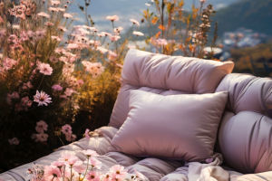
• Cool tones: Blue, green, and purple are cool tones, offering a calm, soothing vibe. They are ideal for private spaces such as bedrooms or study rooms.
• Neutral tones: Neutral colors like gray, beige, and white are versatile and balance well with other colors. These shades can work in any space, offering flexibility and a sense of calm.
By knowing the basics of color, we can use these tones effectively to create different moods and atmospheres in our spaces.
Space Function and Color Principles
Each room serves a different purpose, and the color scheme should cater to the specific needs of that space. Choosing the right colors can enhance both the functionality and comfort of any room.
Public Spaces: Key Tips for Color Matching
Public areas like living rooms and dining rooms are where family members and guests gather, so creating a vibrant and welcoming environment is key.
• Opt for bright, bold colors like red or yellow, which can energize the space.
• Focus on contrast: Pairing contrasting colors or daring combinations can make a striking visual impact.
• Add accent colors: Bright tones or metallics can give the space a modern, dynamic feel.
Private Spaces: Creating Calm and Comfort
Private spaces, such as bedrooms and study rooms, should focus on relaxation and comfort. It's important to avoid overly stimulating colors that might disrupt the tranquil vibe.
• Use soft, muted tones like pastel blues or grays to create a calming environment.
• Focus on comfort and relaxation by selecting colors that soothe the mind and body.
• Steer clear of too-bright colors: Vibrant hues like red or orange might affect your ability to rest and concentrate.
Ceiling, Wall, and Floor Color Tips
The relationship between the ceiling, walls, and floors is critical in interior design. These three elements need to work together to create a balanced, harmonious space.
• Ceiling: Always opt for the lightest shade possible for the ceiling to make the space feel open and airy. White or light hues are great choices to visually extend the height of a room.
• Walls: Choose mid-tone colors for the walls, as these should act as a natural bridge between the ceiling and floor. Ensure the walls complement the flooring for a cohesive feel.
• Flooring: Darker tones for the floor provide a sense of stability. It also contrasts beautifully with lighter walls, creating a visually appealing layering effect.
The Golden Ratio of Color Proportions
Many professional designers use the “7-2-1” ratio when selecting colors for a space. In this rule, the primary color makes up about 70% of the space, the secondary color takes up 20%, and the accent color comprises 10%.
• Primary Color (70%): This should be used in large areas like walls and floors, setting the overall tone for the space. Neutral colors like whites, grays, and beiges are common here.
• Secondary Color (20%): Used in key pieces of furniture like sofas and beds, secondary colors should complement the primary color without overwhelming it.
• Accent Color (10%): This is typically used in accessories and decorative items, like pillows or artwork. A pop of red or gold can draw attention and add energy to the room.
Feng Shui and Color
In Eastern culture, Feng Shui plays a significant role in the relationship between colors and a space's energy. According to Feng Shui, different directions correspond to different colors:
• East (Wood): Green is associated with growth and vitality.
• South (Fire): Red symbolizes passion and energy.
• West (Metal): White represents purity and wealth.
• North (Water): Black is linked to wisdom and depth.
• Center (Earth): Yellow represents stability and balance.
By following these basic Feng Shui principles, we can ensure that our home's color choices help create a balanced, harmonious living environment.
Living Room Feng Shui
• Natural light: A well-lit living room brings positive energy into the space.
• Sofa against a solid wall: This symbolizes having a strong support system.
• Avoid beams above seating: Beams can create a sense of pressure and discomfort.
• Position seats wisely: Arrange seating to face beneficial directions for better energy flow.
Bedroom Feng Shui
• Bed against a solid wall: This provides a sense of security and stability.
• Avoid placing the bed directly opposite the door: It can cause stress and disrupt your sleep.
• Keep the space under the bed clear: This allows energy to flow freely, promoting better rest.
• Position mirrors carefully: Avoid placing mirrors directly opposite the bed, as they can disturb your sleep.
We hope this guide helps you better understand how to choose the right colors for your home. By combining design principles with Feng Shui wisdom, you can create a space that is not only visually appealing but also energizing and balanced. Happy decorating, Lykkers!