We've all had moments where our rooms feel cramped or dark, no matter how clean or organized they are. The truth is, color plays a huge role in how we feel about our space.
The right wall colors can make a room feel bigger, taller, or cozier—without moving a single piece of furniture. Let's explore how we can smartly use wall colors to boost the sense of space at home.
Why wall color matters so much
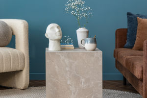
Wall color does more than just look pretty. It influences how light behaves in a room, how we feel, and how spacious a space seems. Light tones tend to reflect more light, making rooms feel open and airy. Darker colors absorb light, often making spaces feel smaller—but warmer and more dramatic when used wisely.
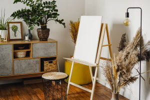
Light colors to open up space
If our goal is to make a room look bigger, go for light and neutral tones. Soft whites, beiges, light greys, and pale pastels help reflect light around the room. These shades blur the corners of the walls and make everything feel more open.
Try these:
• Warm white for a clean, calm look
• Pale grey for a modern, stylish touch
• Pastel blue to add a bit of color without shrinking the room
• Cream or light beige to bring in warmth and brightness
These colors work best in living rooms, bedrooms, or even narrow hallways that could use more breathing space.
Cool tones that feel fresh and wide
Cool colors like soft blues, greens, and light purples tend to recede visually, making the walls feel further away. That's perfect for opening up tight spaces like small bedrooms or bathrooms.
Some cozy-yet-open combos:
• Sky blue walls with white trim
• Mint green in a kitchen or workspace
• Lavender or lilac for a relaxing bedroom vibe
These shades not only give a fresh, open feel but also help lower stress—ideal for places where we rest or recharge.
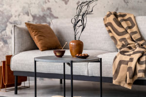
Dark tones used the right way
Dark colors don't have to make a room feel closed-in. When used thoughtfully, they can add depth and drama. The trick is to balance them with good lighting and light-colored furniture or trim.
Try painting just one wall in a deep navy, forest green, or charcoal grey to create a “feature wall.” This pulls the eye forward and gives the room a sense of structure without feeling heavy.
Ceilings and trim matter too
Let's not forget the ceiling and wall edges. Painting the ceiling a lighter shade than the walls can make the room feel taller. Want something bold? Try a white ceiling with slightly darker upper walls to draw the eyes upward.
And for trims (like baseboards, window frames, or crown molding), white or off-white can create contrast that outlines the space and makes it feel crisp and neat.
Tips for making the most of wall colors
Here are a few helpful tips we can follow:
• Stick to a limited color palette: Too many colors can make a space feel chaotic. Choose 2–3 that work well together.
• Use mirrors and light: Combine bright wall colors with mirrors or light fixtures to double the feeling of space.
• Match with flooring: Coordinating wall colors with light-colored floors (like pale wood or tiles) can help the space feel connected and seamless.
• Test before you paint: Colors can look very different under natural vs. artificial light. Paint a small patch first and see how it changes during the day.
Small rooms, big potential
No matter how compact our homes are, using the right wall color can completely transform the way a room feels. Whether we want more light, a feeling of height, or just a little more freshness—color can help us get there without breaking the bank.
Lykkers, which wall color speaks to you?
Have you recently painted your walls or are thinking of doing a refresh? Share your favorite shades or tricks with us! We'd love to know what colors made your space feel bigger, cozier, or brighter. Let's inspire each other to make the most of our homes—one wall at a time.