Have you ever stood in front of a painting and felt a certain emotion surge through you—peace, sadness, joy, or even unease—without knowing why? The answer often lies in the artist's deliberate use of color.
From the rich blues of Picasso's "Blue Period" to the explosive reds of Matisse, color is not just decorative. It is psychological.
Let's explore how famous painters use color to connect with your emotions—often more deeply than you realize.
The Emotional Power of Color
Colors have a direct effect on human psychology. According to research by Dr. Eva Heller, a German psychologist and sociologist, colors are linked with universal emotional responses. For example, blue is often associated with calm and sadness, red with passion or urgency, and yellow with warmth or anxiety.
Artists have understood this intuitively for centuries.
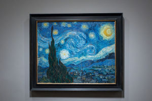
Painters do not just choose colors for beauty—they choose them for impact. When Vincent van Gogh painted "Starry Night" with swirling blues and vibrant yellows, he was not just painting a night sky. He was expressing his emotional turmoil and longing for peace. The cold blue tones contrast with the intense yellow stars, producing a visual tension that reflects internal conflict.
Historical Symbolism of Color
Beyond emotion, colors have carried symbolic meanings through history. In the Renaissance period, painters used color to reflect status and spirituality. Blue, for example, was often reserved for important figures in art due to the rarity and cost of the pigment (ultramarine). This gave the color a rare and noble connotation.
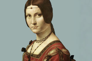
Artists like Leonardo da Vinci and Titian used symbolic color schemes to subtly guide the viewer's emotional and intellectual interpretation of a painting. Green often represented rebirth and nature, while black symbolized mourning or formality. These historical associations still influence how we perceive color today.
Picasso's Color Periods
Pablo Picasso provides one of the clearest examples of color reflecting psychological states. His "Blue Period" (1901–1904) followed the death of a close friend and is filled with melancholic figures bathed in muted blue tones. The blue here conveys grief, isolation, and despair.
In contrast, his subsequent "Rose Period" is dominated by warm pinks and reds, reflecting a lighter, more romantic mood. This shift in palette mirrored a change in Picasso's personal life and emotional state, demonstrating how profoundly colors can map the human psyche.
Color and Cultural Interpretation
It's important to remember that color psychology is not always universal—it can vary across cultures. For example, white is seen as a symbol of purity in Western art but is associated with mourning in some Asian traditions. A painter's background often shapes their use of color.
Take Frida Kahlo, whose vibrant use of red, green, and yellow draws from Mexican folk traditions and reflects themes of strength, suffering, and passion. Her color choices are deeply tied to her heritage and personal identity, making her work feel intensely personal and culturally resonant.
Modern and Abstract Color Use
With the rise of modern and abstract art, color has taken center stage as a communicator of feeling rather than a representation of reality. Artists like Mark Rothko used large blocks of color to evoke complex emotions without depicting recognizable forms.
Rothko believed that color alone could produce a spiritual or emotional experience. Standing in front of his giant red, black, or maroon paintings, viewers often report feeling awe, introspection, or even sadness. His belief in the power of color was so strong that he once said, "A painting is not about experience. It is the experience."
Scientific Insights into Color Perception
Contemporary neuroscience supports the idea that color affects mood and decision-making. Studies by the University of British Columbia found that blue environments can boost creativity, while red tends to increase focus and attention to detail. This confirms what many artists have practiced for centuries: color shapes the mind.
Art therapists also use color when treating patients, recognizing that warm hues can stimulate energy, while cool tones can calm anxiety. So when artists select a palette, they are engaging in a deeply psychological act—often triggering subconscious emotional responses in the viewer.
Color as a Tool for Narrative
Color can also tell a story. In narrative painting, color transitions may mirror the emotional arc of the characters. For instance, in "The Death of Marat" by Jacques-Louis David, the pale colors emphasize the silence and stillness of the scene, guiding the viewer's emotional response toward solemnity and reflection.
Similarly, Edward Hopper's use of harsh lighting and cool tones in paintings like "Nighthawks" evokes loneliness and urban alienation. These color choices are not accidental—they are narrative tools as powerful as any line of dialogue in a film or novel.
Conclusion: Seeing Color with New Eyes
The next time you visit a gallery or look at a painting, ask yourself: Why did the artist choose that color? What emotion or idea is being suggested through this palette? Understanding the psychology behind color choices not only deepens your appreciation of art but also opens up new ways to connect with it.
Have you ever felt unexpectedly moved by a painting without knowing why? Look again. The answer may be in the colors. 🎨