Color has an undeniable power in design—it can set the mood, define a space, and even affect our emotions.
Whether you're revamping your home, redesigning an office, or simply adding new elements to a room, understanding color theory and how to combine colors effectively can make all the difference.
Choosing the right colors for your space isn't just about picking your favorite shades. It's about balancing tones, creating a flow, and making sure the colors work together to enhance the overall aesthetic. If you're unsure how to navigate the colorful world of interior design, don't worry—by following a few key principles, you'll be able to design a harmonious and inviting environment.
1. Understand the Color Wheel
The color wheel is your best friend when it comes to pairing colors effectively. It's a visual guide that shows how different colors relate to one another. The basic wheel consists of primary colors (red, blue, and yellow), secondary colors (green, orange, and purple), and tertiary colors, which are a blend of primary and secondary colors.
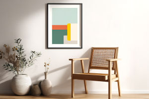
• Complementary Colors: These are colors that sit opposite each other on the wheel, like red and green, or blue and orange. When paired, they create high contrast and make each other pop. These colors work best when you want to make a bold statement, like an accent wall.
• Analogous Colors: These colors sit next to each other on the wheel, like blue, teal, and green. They create a more serene and unified feel because they share common undertones. These color schemes work wonderfully in spaces where you want a more relaxed or cohesive vibe.
• Triadic Colors: These colors are evenly spaced around the wheel, such as red, yellow, and blue. They offer a vibrant and balanced look, with a bit more excitement than analogous schemes. Use them when you want to add energy to a room without overwhelming the senses.
Understanding how colors relate to each other will help you create a design that flows naturally and feels cohesive.
2. Play with Light and Dark Tones
One common mistake in interior design is not balancing light and dark colors properly. Too many dark tones can make a space feel heavy and closed off, while too many light tones can make a room feel flat and lacking in dimension. The key is to balance the two.
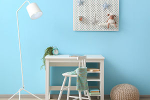
• Light Colors: Whites, creams, pastels, and soft neutrals help to open up a room, making it feel brighter and more spacious. They're great for smaller spaces or rooms that don't get a lot of natural light.
• Dark Colors: Dark colors like charcoal, deep navy, and forest green add depth and sophistication. They're ideal for larger rooms or accent areas like feature walls or cabinetry.
• Accent Colors: Mixing light and dark colors with accent shades can add a layer of depth and texture. For instance, you can pair a soft beige wall with a rich burgundy sofa or a pale grey with a dark wood coffee table. The contrast adds interest without overwhelming the room.
Using a variety of light and dark tones will give your space balance, energy, and depth.
3. Incorporate Neutral Tones
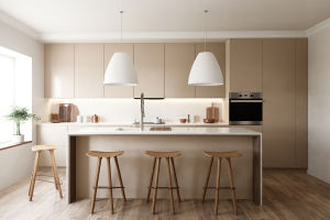
While bright and bold colors are often the star of the show, neutral tones are the unsung heroes of great design. Neutral colors like whites, grays, beiges, and taupes are the backbone of many design schemes because they offer a perfect backdrop for bolder colors.
• Foundation for Bold Colors: Neutrals allow you to add pops of vibrant colors without them becoming too overwhelming. Think a grey sofa with a few bright orange pillows or a white wall paired with a teal painting.
• Versatility: Neutrals are incredibly versatile and can be adapted to nearly any style, from rustic farmhouse to sleek modern minimalism. They also work well in transitional spaces, like hallways or entryways.
• Timelessness: If you're looking for a color palette that won't go out of style quickly, neutrals are your best bet. They have a timeless appeal and are easy to refresh with new accessories.
Neutrals are not boring; they're essential for creating a balanced and versatile space.
4. Create a Focal Point
Every room should have a focal point, and one of the easiest ways to achieve this is through color. Whether it's a bold accent wall, a colorful piece of furniture, or a striking artwork, a focal point gives your space character and draws the eye.
• Accent Walls: Accent walls are a classic way to use color to create a focal point. Choose a color that contrasts with the other walls but complements the overall scheme. This technique works especially well with darker tones or vibrant colors that might feel too overpowering on all four walls.
• Statement Pieces: A brightly colored piece of furniture, like a sofa or armchair, can be a great way to make a statement without overloading the room. It becomes the star of the show while still fitting within the larger color scheme.
• Artwork and Decor: Artwork, rugs, or throw pillows can add both color and personality to your space. They're easy to swap out if you want a change and are a great way to experiment with new color combinations.
A carefully chosen focal point can anchor the room and give it visual interest, without the need for excessive color saturation.
5. Experiment with Color Proportions
Once you have a sense of what colors you want to work with, it's time to think about proportions. The 60-30-10 rule is a helpful guide for how to balance color in a room.
• 60% Dominant Color: This should be the most prominent color in the room—usually your walls or large furniture pieces.
• 30% Secondary Color: This color supports your dominant shade. It could be your upholstery, curtains, or rugs.
• 10% Accent Color: The accent color is the one that adds contrast and interest, like through throw pillows, artwork, or accessories.
By using this simple ratio, you can create a harmonious space without overdoing any one color. This balance keeps things visually interesting while still feeling cohesive.
6. Don't Be Afraid of Experimentation
While guidelines like the color wheel, the 60-30-10 rule, and balancing light and dark tones are helpful, the most important thing is to create a space that reflects your personality and style. Don't be afraid to experiment with different color combinations to find what works best for you.
• Try out bold accent colors, mix patterns, and even incorporate metallics like gold or silver for a touch of glamour.
• Use color to evoke specific moods or energy in a room. A soft, pastel palette can feel calming, while a vibrant, contrasting palette can feel energizing.
Remember, design is about self-expression, so feel free to play around and see what resonates with you.
Conclusion
Color is an incredibly powerful tool in interior design—it can transform any space into something unique, inviting, and functional. By understanding the principles of color theory, balancing light and dark tones, and being brave with your choices, you can create a space that's visually pleasing and personal. Keep experimenting with new combinations, and don't be afraid to embrace the power of color in your next design project!